I’ve decided to do a whole series on the tricks that you need to know in order to take your lettering from “meh” to “yay!!” These tricks are intended to make you want to run to the closest person and give them a huge high five because of the new fabulous makeover that your lettering has received. You may need to call up your mom to tell her just how awesome you’re now going to become and how your life is going to change. Well, maybe that’s a bit of a stretch, but in just five minutes, let’s make your lettering a touch more fabulous!

In these mini-tutorials, I’m going to be focusing on the little things that you can do to make your lettering more professional and eye-catching. Today’s Five Minutes to Fabulous focuses on that pesky transition at the bottom of the letter.
JUNK IN THE TRUNK LETTERING
One of the most telling mistakes in newbie hand lettering, or even intermediate hand lettering, is having junk in your lettering trunk. I’m not just talking about the excess weight that we may all be carrying around right now in our cozy sweatpants because we found out that See’s Candies are all gluten free (oh, is that just me?), but the extra downstroke weight on the bottom of your letter that bleeds into the upstroke. Here’s an example:
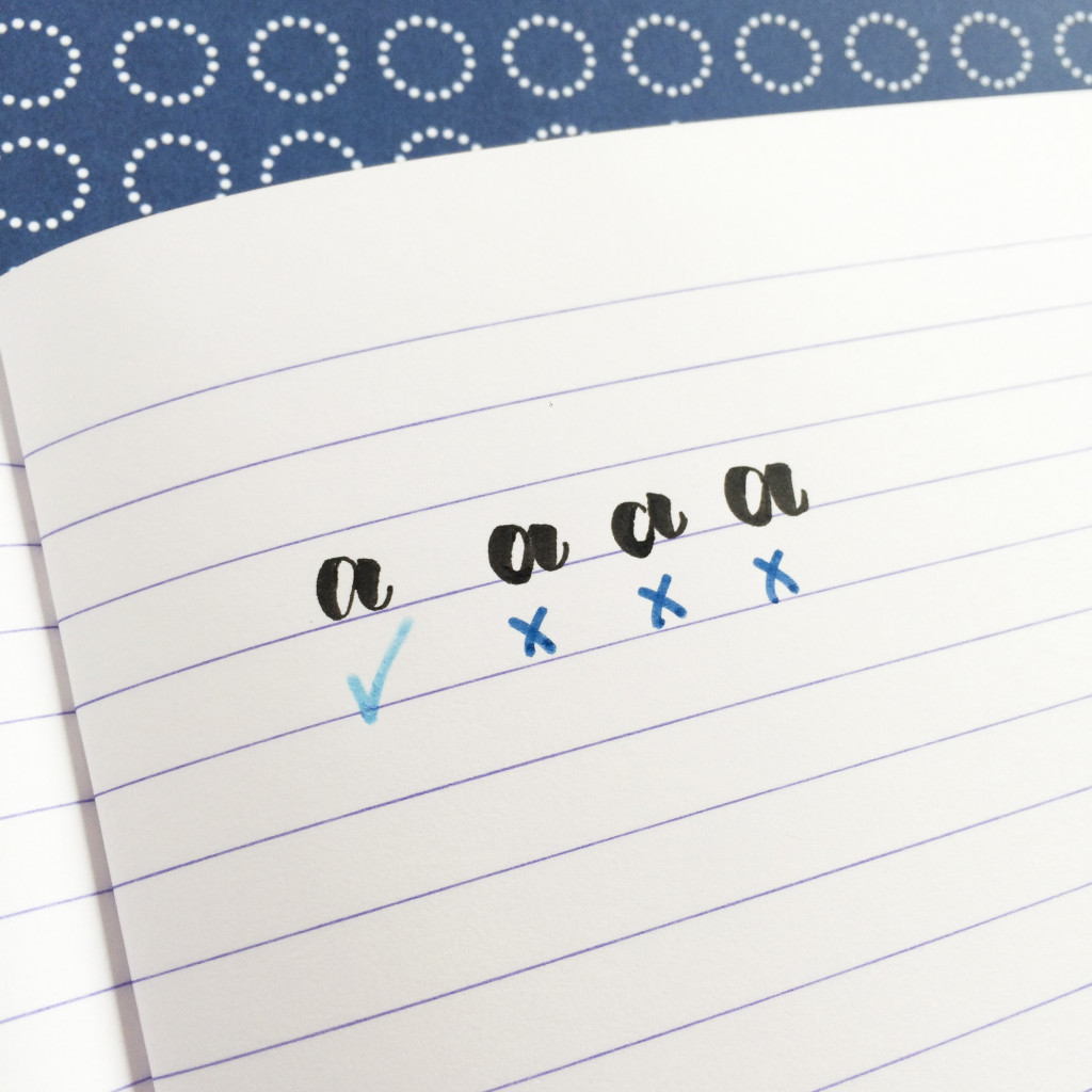
All of the offending letters have heaviness on the bottom of the curve and that should not be there. Why does this happen?
Our brains have a waaaay easier time transitioning from light pressure to heavier pressure. Have you ever noticed that, over time, as you write your hand gets heavier and heavier? It’s just natural as you focus to increase pressure. But when you transition from a downstroke to an upstroke, you need to suddenly lighten your pressure. And when I say suddenly, I mean suddenly!
When I first started lettering, I had the extra weight on my letters all of the time!! In my head I told my hand, “Hand, you need to move to an upstroke, a nice thin line, by the time I start to move up.” And it would say, “Sure!” but then it was doing the exact opposite (it sounds like either one of my children). You probably know exactly what I’m talking about!
YOUR FIVE MINUTE FIX
Well, rather than do something drastic to punish your hand for its misbehaviour, let’s try using an overcorrection first.
Let’s take a look at the steps…
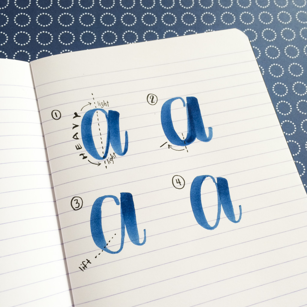
- Your lettering should be heavy on the downstroke and light on the upstrokes. Really, everything on the right of a curve should be light with absolutely not a spot of a downstroke. If you were to draw a line down the middle, the two sides should look drastically different.
- So here’s the rub, your hand is not listening to you and there is still heaviness happening on the right hand side of the letter’s curve. Oh no! I like to imagine that the circle of the a is a clock and rather than thinking about transitioning your stroke at 6 o’clock, you should do the transition at 8 o’clock.
- Beginning that transition earlier will actually cause your transition, which is happening a bit too late, to be right around 6 o’clock. Don’t believe me? Try it! You’re adjusting your timing so that your hand has an extra moment to catch up to your brain. Repeat the 8 o’clock lift until you start to notice consistency in your letter with the transition happening right at the bottom.
- After repetitive practice you won’t need to think about lifting early anymore. Your hand has now gained the muscle memory that it needs to complete the downstroke to upstroke transition at the correct spot and your letters are looking fabulous!
Fist bump!!
9 Comments

I'm going to assume that you're here because you love calligraphy, hand lettering and art... or maybe you just want to know more about it. Either way, you're totally in the right place!
xo
Amanda


Join over 5000 others who have learned to letter (and more) with these lettering courses

Thank you so much for this tutorial! So very helpful!
As a self professed junk in the trunk letterer, this is awesome and SO very helpful! Thank you so much for the visual and tips!!
Hahaha, you’re so very welcome Sarah! I’ll be doing a Letter Better series video all about this as well which might help too 🙂
Thank you for all of these helpful tips! I love hand-lettering and appreciate your willingness to share!
🙂
So simple, but so much information! I like that! Thanks.
This was SUPER helpful! Thanks so much, Amanda!
Thank you! That helped so much, it really does change your lettering!
This is an incredibly helpful tutorial. You are an amazing teacher! Thank you. Thank you.
It really works! That 8 o’clock tip has really helped. Thank you so much, Amanda